You’re running display ads. You’re getting clicks. But those clicks aren’t turning into customers.
Sound familiar?
Most marketers obsess over impressions and click-through rates. But here’s the truth: none of that matters if people aren’t converting.
Conversion rate optimization (CRO) is the difference between burning money on ads and actually getting a return on your investment. It’s about turning visitors into customers — not just getting them to your site.
The good news? With the right tactics, you can dramatically improve your conversion rates without spending more on ads.
This guide breaks down exactly how to do it.
What Is Conversion Rate Optimization (CRO)?
Conversion rate optimization is the process of increasing the percentage of website visitors who take a desired action.
That action could be:
- Making a purchase
- Filling out a form
- Signing up for a trial
- Downloading a resource
- Booking a demo
CRO isn’t about getting more traffic. It’s about making better use of the traffic you already have.
Why CRO Matters for Display Advertising
Display ads cost money. Every impression, every click — you’re paying for it.
If 100 people click your ad and only 2 convert, you’re wasting 98% of your ad spend.
But if you optimize your landing pages, your ad creatives, and your targeting — and you boost that conversion rate to 5% — you just made your ad spend 2.5x more effective without spending an extra dollar.
That’s the power of CRO.
The ROI Impact
Here’s the math:
- You spend $1,000 on display ads
- You get 500 clicks at $2 per click
- With a 2% conversion rate, you get 10 customers
- With a 5% conversion rate, you get 25 customers
Same ad spend. 2.5x more customers.
That’s not theory. That’s what happens when you focus on conversion rate optimization.
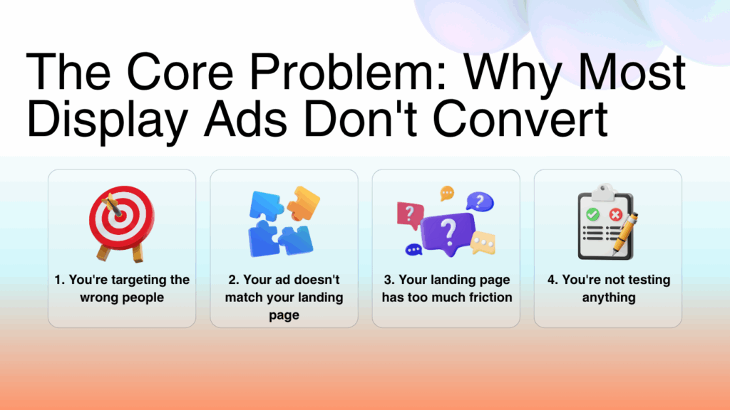
The Core Problem: Why Most Display Ads Don’t Convert
Before we dive into solutions, let’s talk about why most display ads fail.
1. You’re targeting the wrong people
Your ad looks great. Your landing page is solid. But you’re showing it to people who don’t care.
Targeting matters more than creative. If you’re not reaching the right audience, nothing else matters.
2. Your ad doesn’t match your landing page
You click an ad promising “50% off” and land on a page with no discount mentioned. Confusing, right?
Message match is critical. If your ad says one thing and your landing page says another, people bounce.
3. Your landing page has too much friction
Friction is anything that makes it harder for someone to convert:
- Too many form fields
- Confusing navigation
- Unclear next steps
- Slow load times
- Distracting elements
Every bit of friction costs you conversions.
4. You’re not testing anything
You launched your campaign with one ad creative and one landing page. You’re crossing your fingers and hoping it works.
That’s not optimization. That’s guessing.
If you’re not testing, you’re leaving money on the table.
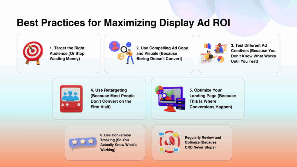
Best Practices for Maximizing Display Ad ROI
Let’s get tactical. Here’s how to actually improve your conversion rates.
1. Target the Right Audience (Or Stop Wasting Money)
The best ad creative in the world won’t convert if you’re showing it to the wrong people.
How to target effectively:
- Use demographic targeting — Age, gender, income, education level
- Target by interests and behaviors — What do they care about? What do they do online?
- Use lookalike audiences — Find people who resemble your best customers
- Exclude irrelevant audiences — Don’t waste budget on people who will never buy
Pro tip:
Start narrow. It’s better to reach 10,000 highly relevant people than 100,000 random ones.
2. Use Compelling Ad Copy and Visuals (Because Boring Doesn’t Convert)
Your ad has about 2 seconds to grab attention.
If it’s boring, generic, or looks like every other ad, people scroll past.
What makes ad copy compelling:
- Lead with a benefit, not a feature — “Save 3 hours a week” beats “Automated workflow tool”
- Create curiosity — “The marketing tactic nobody’s talking about”
- Use numbers — “Increase conversions by 47%” is more believable than “Increase conversions dramatically”
- Address a pain point — “Tired of wasting money on ads that don’t convert?”
What makes visuals work:
- High contrast — Your ad should stand out, not blend in
- Show the outcome, not the product — Show the happy customer, not the tool
- Use faces — Human faces grab attention
- Keep it simple — If people have to think to understand your ad, you’ve lost them
3. Test Different Ad Creatives (Because You Don’t Know What Works Until You Test)
Never run just one ad creative.
Create multiple versions and test them against each other:
- Different headlines
- Different images
- Different calls to action
- Different offers
What to test:
- Emotional appeals vs. logical appeals
- Short copy vs. long copy
- Images vs. video
- Different colors for your CTA button
Let the data tell you what works. Don’t guess.
4. Use Retargeting (Because Most People Don’t Convert on the First Visit)
Only 2-3% of website visitors convert on their first visit.
That means 97-98% of your traffic leaves without buying.
Retargeting brings them back.
How retargeting works:
Someone visits your site but doesn’t convert. You show them ads on other sites reminding them about your product.
Why it works:
- People need multiple touchpoints before buying
- Retargeting keeps you top of mind
- It’s cheaper than acquiring new traffic
Retargeting best practices:
- Segment your audiences (people who viewed product pages vs. people who added to cart vs. people who visited your homepage)
- Show different ads based on behavior
- Set frequency caps so you don’t annoy people
- Exclude people who already converted
5. Optimize Your Landing Page (Because This Is Where Conversions Happen)
Your ad got the click. Now your landing page needs to close the deal.
Landing page optimization checklist:
- Message match — Does your landing page deliver on what the ad promised?
- Clear headline — Can someone understand what you’re offering in 3 seconds?
- Strong call to action — Is it crystal clear what you want them to do next?
- Minimal distractions — Remove navigation, unnecessary links, and anything that pulls attention away from conversion
- Fast load time — If your page takes more than 3 seconds to load, people bounce
- Mobile optimization — Most traffic is mobile. If your page doesn’t work on mobile, you’re losing conversions
- Social proof — Include testimonials, reviews, logos of companies you’ve worked with
Message match and clear calls to action are crucial, but for personalized content, you can use the Bio Generator to create a compelling and professional bio section.
6. Use Conversion Tracking (So You Actually Know What’s Working)
If you’re not tracking conversions, you’re flying blind.
Set up conversion tracking so you can see:
- Which ads are driving conversions
- Which landing pages are performing best
- Which audiences are converting at the highest rate
- Which creative elements are working
What to track:
- Completed purchases
- Form submissions
- Trial signups
- Downloads
- Demo requests
Use tools like Google Analytics, Facebook Pixel, or your ad platform’s built-in tracking to measure everything.
7. Regularly Review and Optimize (Because CRO Never Stops)
CRO isn’t a one-time project. It’s an ongoing process.
What to review regularly:
- Conversion rates by ad creative
- Conversion rates by audience segment
- Landing page performance
- Form completion rates
- Bounce rates
Look for patterns. What’s working? What’s not? Make adjustments and test again.
CRO Best Practices: The Details That Make the Difference
Let’s go deeper on the tactics that actually move the needle.
Define Your Conversion Goals (So You Know What Success Looks Like)
Don’t optimize for “conversions” in general. Be specific.
What exactly do you want people to do?
- Purchase a product?
- Schedule a call?
- Download a whitepaper?
- Start a free trial?
Your optimization strategy changes based on the goal.
Conduct User Research (So You Understand Your Audience)
Don’t guess what your audience wants. Ask them.
How to do user research:
- Run surveys asking why people bought (or didn’t buy)
- Conduct focus groups or user interviews
- Analyze support tickets to identify common objections
- Use session recordings to see how people actually use your site
The more you understand your audience, the better you can optimize for them.
Analyze Website Data (To Find What’s Broken)
Use tools like Google Analytics, Hotjar, or Crazy Egg to understand how people interact with your site.
What to look for:
- Pages with high bounce rates (people are leaving immediately)
- Forms with high abandonment rates (people start but don’t finish)
- Pages with low scroll depth (people aren’t reading your content)
- Heatmaps showing where people click (or don’t click)
Data shows you where the problems are. Then you can fix them.
Test and Analyze (Because Assumptions Kill Conversions)
Don’t assume you know what will work. Test it.
Use A/B testing to compare different versions of:
- Headlines
- CTAs
- Images
- Form lengths
- Page layouts
Run one test at a time so you know exactly what caused the change in performance.
Use Customer Feedback (Because Your Customers Know What’s Wrong)
Ask customers why they converted. Ask people who didn’t convert why they left.
You’ll learn things you never would have discovered through data alone.
Minimize Friction: Make Conversion Effortless
Friction is anything that makes it harder to convert.
Every extra step, every confusing instruction, every unclear button — that’s friction.
And friction kills conversions.
How to reduce friction:
1. Make navigation simple
Don’t make people hunt for what they need. Use clear, intuitive navigation that guides them to the conversion point.
2. Simplify the conversion process
Every extra step reduces your conversion rate.
- Buying a product? Make checkout as short as possible.
- Filling out a form? Ask only for essential information.
- Signing up for a trial? Don’t require a credit card if you don’t have to.
3. Use clear, concise messaging
Don’t make people think.
Tell them exactly what you’re offering and exactly what they need to do next.
4. Optimize your forms
Forms are often the biggest source of friction.
Form optimization tips:
- Only ask for necessary information
- Use autofill wherever possible
- Show progress indicators on multi-step forms
- Use inline validation (tell people immediately if they made a mistake)
- Make error messages helpful, not confusing
5. Remove distractions
Every element on your landing page should move people toward conversion.
If it doesn’t, remove it.
Cut:
- Unnecessary navigation links
- Sidebar widgets
- Pop-ups (unless they’re part of the conversion flow)
- Unrelated content
6. Use social proof
Trust reduces friction.
Include:
- Customer testimonials
- Reviews and ratings
- Trust badges (secure checkout, money-back guarantee)
- Logos of well-known clients
People are more likely to convert when they see others have already done it successfully.
Optimize Your Web Forms (Because Bad Forms Kill Conversions)
Forms are where most conversions happen — and where most conversions die.
How to make forms shorter and more effective:
1. Only ask for necessary information
Every field you add reduces your completion rate.
Ask yourself: Do I really need this information right now? Or can I get it later?
2. Use progressive forms
Progressive forms only show fields relevant to the user’s situation.
Example: If someone selects “I’m a freelancer,” don’t show fields asking for company size.
3. Use smart defaults
Pre-fill fields with common information:
- Location (based on IP address)
- Most popular options
- Information from previous interactions
This saves users time and makes the form feel shorter.
4. Use dropdowns and checkboxes instead of text fields
These take up less visual space and feel less intimidating than open text fields.
5. Use a single-column layout
Multi-column forms confuse people. Stick to one column — it’s easier to scan and complete.
Place Your CTA Where People Can Actually See It
Your call to action is the most important element on your landing page.
If people can’t see it, they won’t click it.
Best practices for CTA placement:
1. Put it above the fold
The fold is the bottom of the screen before someone scrolls.
Your CTA should be visible immediately when someone lands on your page — no scrolling required.
2. Make it stand out
Use contrasting colors that grab attention. If your page is mostly blue, make your CTA button orange or red.
3. Use clear, action-oriented copy
Don’t use generic CTAs like “Submit” or “Click Here.“
Use specific, benefit-driven language:
- “Get My Free Trial”
- “Download the Guide”
- “Start Saving Money”
4. Use white space
Surround your CTA with empty space so it stands out and draws the eye.
5. Test different placements
Use A/B testing to find the optimal placement for your CTA. What works for one audience might not work for another.
How to Check Your Competition and Improve Your CRO
Your competitors are already running display ads. Learn from them.
How to analyze competitors:
1. Visit their websites
Look at:
- Their landing page design
- How they structure their CTAs
- What information they ask for in forms
- How they use social proof
Don’t copy them. But learn from what they’re doing.
2. Use competitive analysis tools
Tools like SimilarWeb, Ahrefs, and SEMrush can show you:
- Where your competitors are getting traffic
- Which keywords they’re targeting
- How their traffic has changed over time
3. Test and analyze
Use what you learn from competitors to create your own tests.
See something working on a competitor’s site? Test a version of it on yours.
4. Use customer feedback
Ask your customers what they looked at before choosing you. What did competitors do wrong? What did you do right?
This tells you where you have an advantage — and where you need to improve.
Conclusion
Maximizing the ROI of your display advertising comes down to one thing: conversion rate optimization.
You can have the best ad creative in the world. But if your landing page doesn’t convert, you’re wasting money.
Focus on:
- Targeting the right audience
- Creating compelling ads
- Testing everything
- Optimizing your landing pages
- Reducing friction
- Tracking conversions
CRO isn’t a one-time project. It’s an ongoing process of testing, learning, and improving.
But the payoff? Massive. You’ll get more customers from the same ad spend — and dramatically improve your ROI.
Start with one improvement today. Then keep optimizing. The results will follow.

Zawwad Ul Sami is an indie SaaS founder and growth strategist, best known for building and scaling lean, profitable micro-SaaS products. He currently leads Bizreply, an AI platform that helps brands find high-intent social conversations and craft smarter replies at scale.
With multiple micro-SaaS exits and a portfolio that includes tools like Mailtoon, Tweetsy, MySaaSBoilerplate, and Convert My Bank Statement, Zawwad has earned a reputation for fast execution and practical growth tactics. He actively shares insights on product building, social growth, and the micro-SaaS ecosystem, inspiring makers who want to launch and iterate quickly.
Leave a Reply